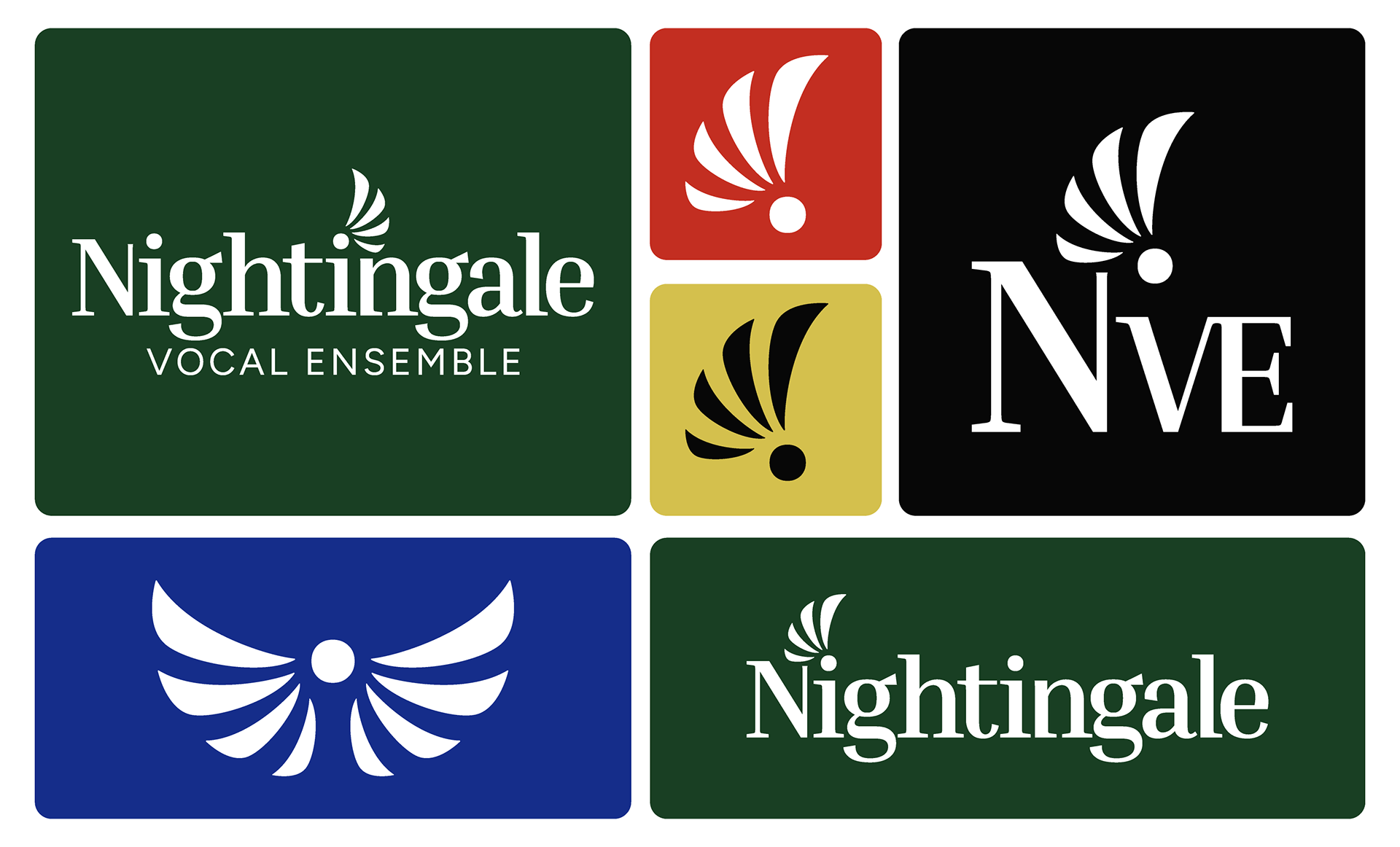
Previously, Nightingale only had a single, low-resolution file of their logo. I recommended creating a versatile logo suite with multiple variations that could be used across different platforms and applications.
The client and I had several meetings to discuss what they liked about their existing logo, what they felt wasn't working, and what opportunities the new branding could explore. Together, we reviewed competitor brands and determined where Nightingale could land visually to feel at home within the existing space while still standing out as a unique ensemble.
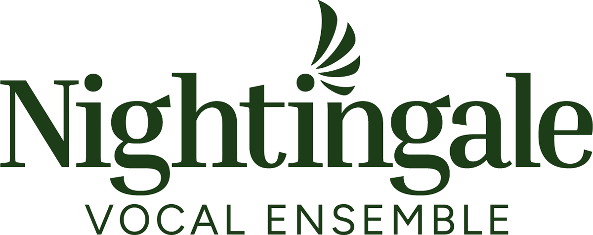
We ultimately landed on a logo suite built around a clean serif typeface paired with an accompanying sans serif, giving a subtle nod to their original logo while creating something more versatile. We simplified the nightingale bird into wings, using four individual elements as a subtle nod to music often being written in 4/4 time.
The final logo suite included a horizontal logo, square logo, monogram, signet, and a standalone double-wing graphic that could be used throughout the brand.
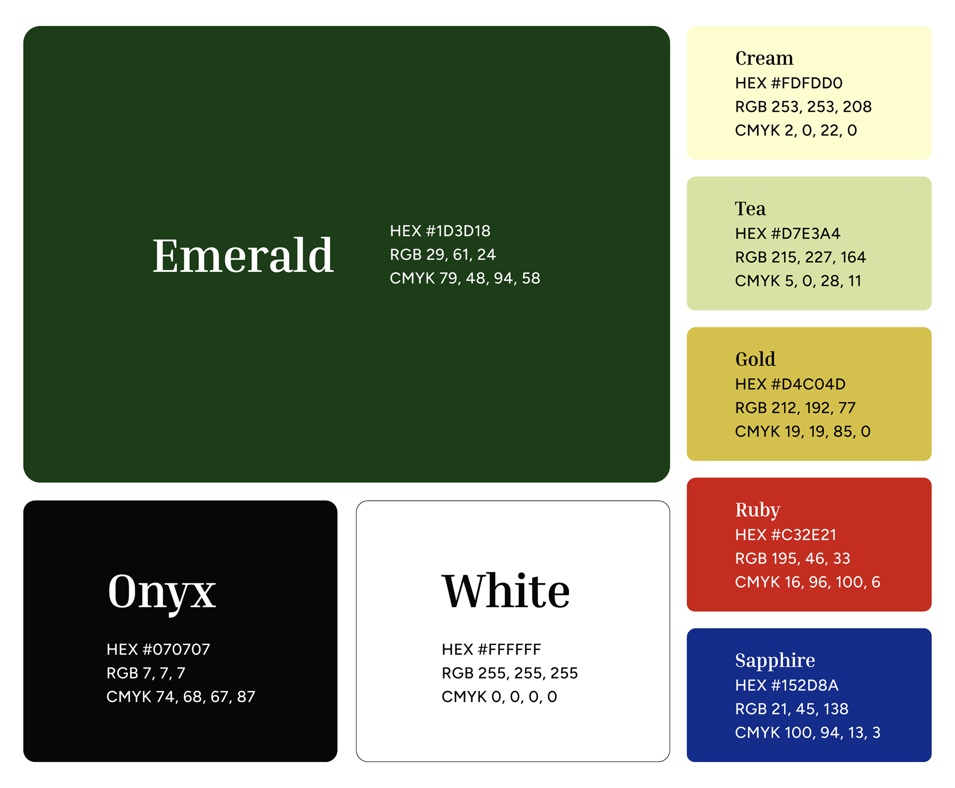
The final deliverables included the complete logo suite in PNG and SVG formats, along with a 12-page style guide designed to give Nightingale a strong foundation for their new brand. The guide included a company overview, updated mission statement, brand tone and voice, target audience, logo breakdown and usage, color palette, and fonts.